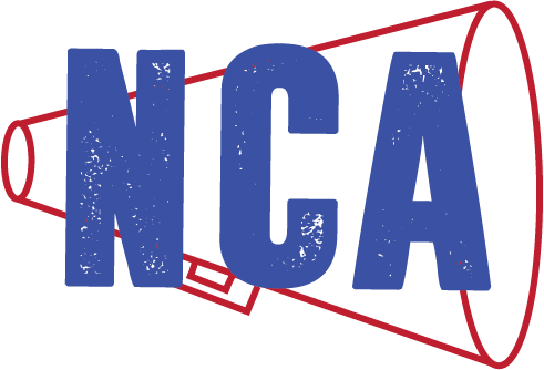
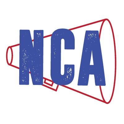
This logo is the final design after feedback from my first draft. Throughout the project there is repetition of red and blue, which are the colors of the company. The consistency of using Dreamwalker as a font brings all aspects together. Placing the letters on top of the megaphone gives the logo depth and proximity.

This business card is simple and clean. The logo is the main focus because it will be an ionic logo in the cheerleading world. The colors are a bold red and a bold blue, showing that this is a strong company. The address and the phone number are clear and visible. Everything is centered to the logo. The company has had the colors of red white and blue since the start of the company and I want to keep that consistent.
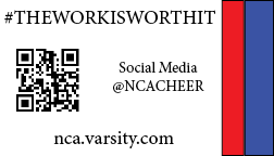
This is the back of the business card. I decided to use a back so that the front wouldn’t be crowded with all the information that I want people to know. For the back the QR code is the main focus because it leads you to the main website of the company. If a person doesn’t know what a QR code is at the bottom is the website that the QR code is linked to. I added the company’s trademark and hash tag for people to start adding on their social media. Also I added the username @NCACHEER because that is the name of the company on all social media including facebook, instagram, snapchat, and twitter. For the back the bold red and blue are on the right side because when you flip the card over it will be on the same side no matter if its front or back .
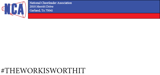
Envelope is consistence with the rest of corporate identity by having bold red and blue stripes at the top. The new envelope lines stop right before the logo so there isn’t a white block around the logo as well as the red or blue blending in with the colors of the logo. Adding the hash tag is also repetition from the rest of cooperate identity. I left the barcode space alone so there aren’t any problems with the post office. This is a clean and professional envelope.
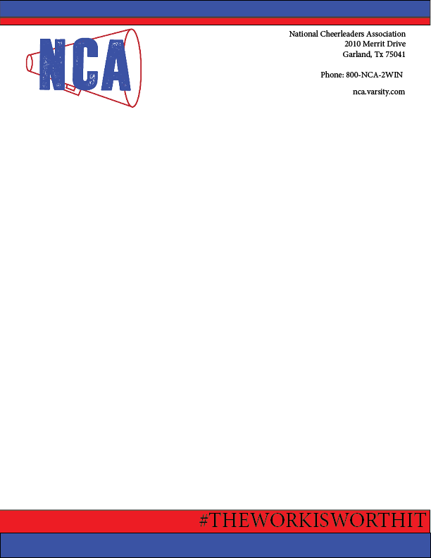
The letterhead is an important aspect to a company. This letterhead keeps consistent by having red and blue bars at the top and bottom of the letter. After getting feed back from my first letterhead I right aligned the contact information to make it look a little more pleasing and have appropriate proximity to the logo on the other side that is on the left. Using repetition I added the hashtag at the bottom of the letter.

By placing a text outline in the form of a letter will give an example of how the letter will look with everything put together. This letterhead allows a lot of room for text. The proximity of all aspect of this letterhead makes it flow and appealing to the customer.
Twitter is a huge outlet for any company. This is an edited version of what I had before. Before I had a background to make the logo pop, but it took away from my logo, but just having the logo keeps it consistent and provides repetition. Proximity works great because it isn’t close to the edge, it is right in the middle with a white background to make the logo pop even more.
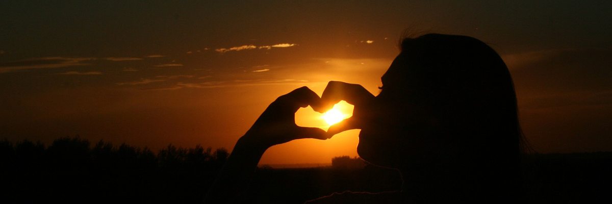
The twitter header is a great accent to the profile picture. This is the edited version, before I had the logo on the header, but didn’t need it since the logo is the profile picture. I didn’t need it in both spots. Having a sunset gives the twitter page a peaceful setting.
Facebook is a huge outlet for any company. This is an edited version of what I had before. Before I had a background to make the logo pop, but it took away from my logo, but just having the logo keeps it consistent and provides repetition. Proximity works great because it isn’t close to the edge, it is right in the middle with a white background to make the logo pop even more.

The Facebook header is a great accent to the profile picture. This is the edited version, before I had the logo on the header, but didn’t need it since the logo is the profile picture. I didn’t need it in both spots. Having a sunset gives the Facebook page a peaceful setting. The sunset is consistent with twitter and shows repetition by have the same kind of header, a heart to show love for the company.
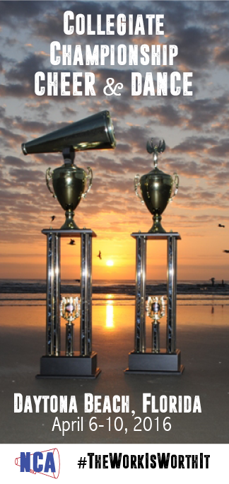
For a magazine ad it is important to grab your audiences attention. I decided to use an actual picture of the trophies you would win at college cheerleading nationals. This competition is on the beach so; it’s the perfect background for the picture. By using the same font as the logo as the text on the ad showed repetition. On the final product I added a white box at the bottom of the ad to make sure the hashtag and the logo was easy to see. The sand was hard to have my logo pop against. Adding the hashtag, logo, and the red and blue shows consistency. The proximity of the text makes the flow of the ad pleasing to the eye. This ad is eye catching and want you to attend the cheerleading nationals as a participant or spectator.
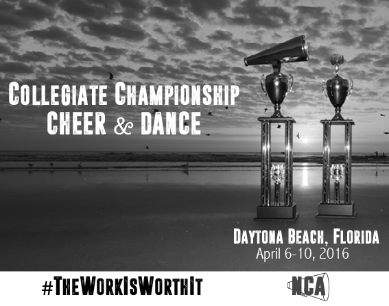
For a newspaper ad it is important to grab your audiences attention without color. I decided to use an actual picture of the trophies you would win at college cheerleading nationals and it is the same as the magazine to show repetition as well as consistency, but exported in gray scale for newspaper. This competition is on the beach so; it’s the perfect background for the picture. By using the same font as the logo as the text on the ad showed repetition. On the final product I added a white box at the bottom of the ad to make sure the hashtag and the logo was easy to see. The sand was hard to have my logo pop against. Adding the hashtag and logo shows consistency. The proximity of the text makes the flow of the ad pleasing to the eye. This ad is eye catching and want you to attend the cheerleading nationals as a participant or spectator.


